
Alabaster Sherwin Williams: A Timeless Shade for Every Home
Choosing the right white paint isn’t always simple, too stark can feel cold, while too creamy may turn yellow. Alabaster Sherwin Williams (SW 7008) strikes the perfect balance, offering a warm yet neutral look. Loved by designers and homeowners alike, it was even named Color of the Year in 2016. From cozy interiors to timeless exteriors, Alabaster continues to be a go-to choice.
Understanding the Shade of alabaster sherwin williams
Alabaster is a warm white that feels soft and welcoming, yet neutral enough to adapt to different lighting. Its gentle beige and gray undertones keep it balanced, avoiding both harsh coolness and overly yellow warmth. Compared to bright whites, it looks creamier and cozier, while next to richer creams it feels lighter and fresher, making it a truly versatile choice for any home.
Where to Use Alabaster in Your Home
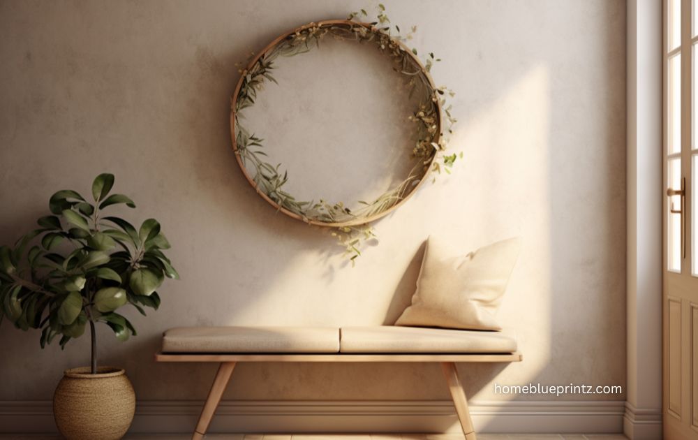
Alabaster isn’t just for walls, it’s versatile enough for nearly any surface. In living rooms and open spaces, it creates a warm backdrop that allows furniture and décor to shine. Kitchens also benefit from its softness, especially on cabinets paired with wood accents, brass hardware, or matte black finishes.
For exteriors, Alabaster delivers timeless curb appeal. From farmhouses to cottages, it looks fresh and clean without being stark. Its natural softness helps it blend seamlessly with outdoor surroundings while maintaining a modern edge.
Pairing Alabaster with Other Colors
Alabaster pairs beautifully with both bold and subtle shades, making it easy to create the look you want. Whether you prefer contrast or a softer blend, it adapts with ease.
-
Trim Colors: Pure White or Extra White for a crisp contrast, or Alabaster itself for a seamless look.
-
Bold Accents: Navy, forest green, charcoal, or black create striking combinations.
-
Neutral Tones: Beige, taupe, and soft gray build a calm, cohesive palette.
The Impact of Lighting on Alabaster
Lighting can change how Alabaster looks throughout the day. In natural daylight, it often feels brighter and closer to true white. Under warm bulbs, it leans creamier and softer.
Room direction matters, too. North-facing spaces can bring out its gray side, while south-facing rooms highlight its warmth. Testing a sample on your walls is the best way to see how it reacts in your home.
Design Styles That Suit Alabaster
Alabaster works beautifully across many design styles, offering warmth and balance without overpowering a space. Its versatility makes it a trusted choice for both modern and traditional homes.
-
Modern Farmhouse: Perfect with shiplap, rustic wood, and black accents.
-
Minimalist/Contemporary: Provides a clean, soft backdrop for sleek furnishings.
-
Traditional/Classical: Enhances crown molding, wood floors, and antique décor.
Pros and Cons of Alabaster Sherwin Williams
Pros:
-
Warm and inviting without looking yellow
-
Neutral enough to suit many design styles
-
Versatile for both interiors and exteriors
Cons:
-
Can appear creamy next to very bright whites
-
Shifts noticeably with lighting, which some may find unpredictable
Tips for Using Alabaster Successfully
Alabaster looks best when used thoughtfully, considering lighting, materials, and accents. A few simple guidelines can help you get the most out of this timeless shade.
-
Test samples first – Try it on your walls in different lighting before committing.
-
Pair with natural textures – Wood, linen, stone, and leather enhance its warmth.
-
Add metallic accents – Brass, gold, or matte black pop beautifully against it.
-
Maintain regularly – Being a light shade, it shows dirt more easily, especially outdoors.
Alternatives to Alabaster
If you’re not completely sold on alabaster sherwin williams but love the idea of a warm white, Sherwin Williams offers several alternatives. Snowbound is slightly cooler and feels crisper, making it a good option if you want less warmth. Pure White is a versatile true white that has minimal undertones, great for trim or spaces where you want a cleaner look. Greek Villa, on the other hand, is warmer than Alabaster and works beautifully in traditional spaces where you want a bit more richness.
Conclusion
Sherwin Williams Alabaster is not just another white paint, it’s a timeless choice that has earned its place as a designer favorite. With its perfect balance of warmth and neutrality, it can adapt to virtually any space, style, or lighting condition. Whether you’re dreaming of a modern farmhouse kitchen, a serene bedroom retreat, or a fresh new exterior, Alabaster is a reliable and beautiful option. Its ability to blend seamlessly into different color schemes and design aesthetics ensures that it will remain a go-to shade for years to come.
FAQs About alabaster sherwin williams
- Is Alabaster too white for walls?
No, it’s not too white. Its soft undertones make it feel warm and inviting rather than stark or cold. - Does Alabaster go with gray?
Yes, it pairs wonderfully with both light and dark grays, creating a balanced and sophisticated look. - Is Alabaster good for exteriors?
Absolutely. It’s a favorite for farmhouse and traditional exteriors, offering a timeless, clean finish. - What trim color pairs best with Alabaster?
Crisp whites like Pure White or Extra White create a beautiful contrast, while Alabaster itself can be used for a seamless look. - How does Alabaster compare to Pure White?
Alabaster is warmer and softer, while Pure White is crisper and cooler, making it better suited for trim and accents.
Share this content:


Post Comment