Medium Blue:The Perfect Balance Between Bold and Calm
When designing a space, color choice plays a huge role in shaping the mood and atmosphere of your home. Among all the shades that strike a perfect balance between bold expression and calming energy, medium blue stands out as a quiet, confident favorite. It’s a color that invites tranquility without fading into the background a hue that gently draws attention while offering peaceful energy.
Whether you’re decorating a bedroom, painting a living room, or adding personality to a kitchen, medium blue offers the perfect middle ground. It’s bold enough to make a statement, yet soft enough to feel comforting. If you’ve been searching for a color that does it all, this might be the one.
What Makes Medium Blue So Special?
Unlike pale sky blues or dark navies, medium blue sits comfortably between the two. This balance gives it a versatile charm that’s hard to replicate. It’s rich in pigment but never overpowering, and its depth allows it to work in both bright, airy rooms and cozier, more enclosed spaces.
What truly makes medium blue special is its adaptability. It can take on different personalities depending on what you pair it with: bright and fresh with whites and soft neutrals, dramatic with darker tones, or warm and organic with natural wood. It’s this flexible nature that makes feel timeless, rather than trendy.
Medium Blue Work Best in a Home
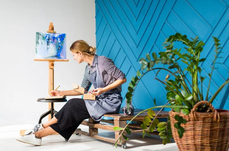
The beauty of medium blue lies in its versatility; it can work just about anywhere. In living rooms, it creates a grounded yet inviting atmosphere, offering just the right amount of color without being overwhelming. It’s a wonderful shade for spaces where you want to relax and unwind without sacrificing sophistication.
In bedrooms, adds a peaceful, serene touch that encourages restfulness. When used on walls or bedding, it promotes calmness without feeling cold. It’s also a great option for accent walls, upholstered furniture, or curtains, especially when paired with creamy whites or muted grays.
Kitchens and bathrooms also benefit from the clean, crisp look of medium blue. Whether on cabinets or tile, it adds charm and depth to these functional spaces, making them feel more personal and refined.
Why Is Medium Blue So Popular in Interior Design?
Color trends come and go, but certain shades remain favorites year after year and medium blue is one of them. It’s popular among interior designers because it offers so much flexibility. While soft enough to serve as a neutral, it still brings more personality than beige or gray. It’s a color that feels safe yet sophisticated.
Another reason for its popularity is its ability to look good in many types of light. In natural daylight, medium blue appears fresh and open. In warm artificial lighting, it deepens slightly and takes on a cozier feel. This chameleon-like quality makes it suitable for various settings, from sunlit kitchens to dim, moody reading nooks.
Designers also love how easy is to work with. It plays well with other hues like terracotta, blush, olive green, mustard, and cream and it works with both modern and classic aesthetics. Whether you prefer minimalism, vintage charm, or bold eclectic style, medium blue fits right in.
Can Medium Blue Work in Small Spaces?
Yes, absolutely. There’s a common misconception that darker or bolder colors should be avoided in small rooms, but that’s not always true. In fact, medium blue can make smaller spaces feel more intentional and enveloping. Rather than shrinking the room, it gives it a sense of depth and character.
Using medium blue in a small powder room, for example, can create a rich, jewel-box effect. In a compact bedroom or office, it adds a sense of tranquility that makes the space feel like a retreat. The key is to balance it with lighter trim, soft fabrics, or reflective surfaces to keep the space feeling open and comfortable.
Medium Blue Affect Mood and Atmosphere
Color psychology plays a big role in how we respond to our environment, and blue is widely known for its calming qualities. But medium blue offers a bit more complexity than lighter shades. While still serene and gentle, it also brings a quiet strength.
Rooms painted in often feel centered and composed. The color encourages relaxation, thoughtfulness, and a sense of emotional balance. That makes it especially effective in spaces where you want to slow down and disconnect like bedrooms, reading corners, or even meditation areas.
At the same time, medium blue doesn’t make a space feel overly soft or delicate. It maintains a subtle boldness that feels confident and mature, making it a great choice for shared living spaces or creative studios as well.
The Medium Blue a Good Color for the Long Term
One of the most practical benefits of medium blue is its timelessness. While some shades feel trendy or overly specific to a particular design era, has proven to be enduring. It can evolve with your style, adapting to new furniture, accents, or décor themes without needing to be replaced.
Whether your taste leans toward coastal, Scandinavian, farmhouse, or urban chic, medium blue can complement it. And as color trends continue to explore deeper and more expressive tones, medium blue remains a safe and stylish choice that won’t go out of fashion.
Final Thoughts
In a world filled with extremes bright whites, stark blacks, vivid reds, medium blue offers a welcome sense of balance. It brings color to a room without shouting, and calm without fading into the background. It has just the right depth to stand out while still blending beautifully with its surroundings.If you’re looking for a paint color or design accent that feels fresh, versatile, and emotionally grounding, medium blue is a natural choice. It suits nearly every room, works with a wide variety of styles, and offers a mood that is both peaceful and confident.
Share this content:


Post Comment